Sunday, August 7, 2011

Streamlining social media- my "big 3" tools

I'll be honest... I tweet, A LOT.

None of my tweets are automated. I pick and schedule every one myself. Yes, I schedule; and you should too, because the world and the internet run 24/7. I've come to enjoy the interactions with such a wide variety of people that social media allows me to have. For a while I felt like I was chocking on social sites, that the return wasn't there and that I was wasting my time. As it turns out, I wasn't wasting my time, I was just wasting time. I've since found a few gems that have helped me cut a ton of time out of my social media routine, and I hope that in sharing them with you, you can streamline your social media interactions as well!

Organization is key; if you have things fed into you, you'll have more time to find and create great content, and more importantly, to listen to what people post. Here are a few of my organizational tools that I think you can use to help you as well!

Social Media dashboard- Hootsuite (pro)
Hootsuite is a great way to keep everything organized. It allows me to see my home feed, mentions, retweets and direct messages all on one screen. If you run multiple twitter, facebook, facebook fan pages or linked in accounts, Hootsuite can't be beat. I run 4 twitter accounts, a facebook, fan page, linked in and ping.fm through my hootsuite, and having it all in one space is indispensable.


One of the greatest innovations in Hootsuite is the "Publisher" tab; It allows me to see when all of my content is scheduled for, and make adjustments as needed. I can filter it by one account or all of my accounts, and it is a HUGE time saver. I strongly suggest going pro; it allows you more than 5 linked accounts, analytics, and bulk scheduling for less than 6 bucks a month.


RSS reader: Google Reader
One of my biggest time expenses was trolling the internet for great content. I realized that over and over again, I went to the same 100 or so sites to get stuff to post. Visiting 100 sites a day, and all of the sidetracking that goes a long with it takes a hell of a long time. I found that feeding those sites' RSS feeds into google reader had cut hours out of the amount of time that I've spent on social media. 


I have a 45 minute train commute to work each day, and thank to the wonders of mobile wi-fi, I've got an internet connection the whole way. I used to just play a game, or listen to music, now I use that "dead" time looking over content, starring what I want to post and spend less "live" time looking for content.

One of the things that has made this so easy for me is Hootsuite's chrome extension; I'm now 2 clicks away from sharing content found through google reader.

Follower Management: SocialBro
SocialBro is a new addition for me; it has however made finding new followers, unfollowing those that don't follow back, and figuring out when to tweet pretty simple. I used to rely on #followfriday recommendations and Retweets of good content to find my new followers; with SocialBro, I can say" find all the people on twitter that have 1000-10,000 followers, a follower/follow ratio of no more than 2 that have tweeted in the last 3 days" and boom, there they are. I can target in on tons of indicators as I deem important, browse the profiles of those that come up, and meet a ton of new, interesting people. 

SocialBro is in Beta right now, but the potential is there for this to be a wonderful addition to any social media toolbox!

Those are my big 3 right now; What do you use to make social media more manageable? If you've got suggestions, I've got time to check them out now that I've freed up all of this time!

Monday, August 1, 2011

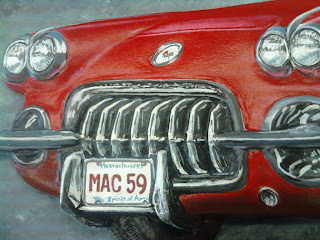
A "halfway there update on the "Johnny Mac" sign

We started this sign about 2 months ago, and although things have progressed slowly because it's been so busy, things have started rolling really quickly.

The sign is an HDU (high density urethane) wall sign; We use HDU because it is lighter than mahogany, flatter than mohogany, easier to shape and doesn't wick in water, so down the road it looks better, longer because it won't check, warp or crack.  In David's conversation with the client, he stated he wanted a carved 1959 corvette on there, as well as the flags- the rest was up to us. David got to work on a quick thumbnail sketch, and we hit the ground running!

I love the way this man sketches.
After a few layout and color tweaks, here is the rendering.

And a close-up view of the sign.

David got to programming the CNC router, And soon we had a roughed out shape.


Bob, our master carver with more that 20 years of experience, put his tools to work, refining and rolling over the banner and flag edges, and carving a corvette out of that big block of foam in the middle. You can see the reference photo at the top of this pic.

Bob's ability to turn foam into detail is amazing.
Once the car was where we all wanted it, the sign went off to paint for 2 coats of primer and 2 coats of Lava Grey. David hand stippled the background himself, and then the detail painting could begin.

I was out of the shop for 3 days with a bad back, so I was amazed at the progress when I came in this morning. The Vette was completely painted!


The level of detail is incredible; I ws amazed to see that we captured all of the iconic elements of this car.

Those fins- so beautiful! See the steering wheel through the windshield glare?

Down to the nubs on the tires. 

We were even able to get his vanity plate on there, just to make it even more personal!

The depth of this carving is incredible! Even that shadow looks true to life!


A few coats of finish paint and some gold leaf are all that's needed to get this sign ready for installation- I'm getting really excited, and I can't wait to show you the final results!


Saturday, July 30, 2011

It's not you... it's your dividend.


I've taken to playing Empire Avenue lately, and it's a pretty cool social media stock simulation. You buy and sell shares of people, their dividends are based on their social media  activity, and their share price on how popular their stock is. The game has one (other highly influential users say more) major flaw: the underlying social network that surrounds the game.

Most people's social media experience consists of the time they spent on myspace, the time they spend on facebook, and the limited interaction that they have on twitter with people they probably already know. The one thing that these 3 social media sites have created is a "follow back" phenomena. Myspace and Facebook was automatic; you and I became friends, and you can see all of my information and I yours. Twitter lends itself to an attitude of "well, if he isn't going to follow me, I'm not going to follow him." There are tens of sites dedicated to finding out who doesn't follow you so that you can "dump" them.

In addition to the stock simulation, Empire Ave added a social aspect to the game as well; there are communities, you can post "shout outs" on people's wall, and send messages to their inbox. These are all actions that are reminiscent of the social networks we're used to, so it's easy to see how "The Ave" could be confused for a facebook companion. Here's the thing: It's NOT a social network. It's a stock simulation, and the social aspects that surround it are bad for the game; it would have more fidelity without them.

The real stock market is not a "follow back" scenario. If I buy proctor and gamble, they're not going to come down and buy 10 grand worth of signs from me.In fact, I'm pretty sure that's illegal on quite a few different levels. Instead, when I buy their stock, I buy based solely on one premise:

At that moment, while I'm purchasing their stock, they are the single best place that I can put my money.


In this game, the more money you have, the more you can invest; make wise investments and you've got more money to invest in more wise investments, and soon you're snowballing your way to riches, and supporting those that are working their butts off creating those wise investments. If I put that money into someone who isn't the place that has the best return, I'm investing with emotion, a strategy that is wrapped in failure a thousand times over. If you're dividend's ROI is .65% and I buy you instead of someone who has a ROI of 1.45%, I've done myself, my investors, and further on down the line I've artificaillay inflated your stock with unearned value, undermining the game itself.

I know people don't invest nearly as much time as I do in social media, and there are only so many Chris Voss' and Chris Pirillo's who can be active 24/7 with their superhuman abilities to not sleep. That's where the gap in dividend and share price comes from- the more active you are, the higher they both will be. You are not going to have a 200(e) share price with the 5 posts you make to facebook daily and 3 posts you make to twitter every other day; It takes a lot of work. I have an unusually high 500+ tweets sent this week; Chris Voss has TWO THOUSAND. I'm realistic enough to know that the chances of me leapfrogging over Mr V are very slim.

It's painful to be dumped.  In real life, on twitter, or in Empire Ave. I've had people leave me shout outs asking why I didn't buy their stock back, or angry messages asking why I dumped their stock, and my response is the same every time- "I'm not saying goodbye forever, I just found an investment that can make my shareholders more money. If things pick up, I'll be back!"

Empire Avenue isn't a social network. I'm not looking to add to the 75 tweets, 25 facebook posts and myriad other actions that are involved in providing a good dividend for my investors every day; I'm looking to play the game for what it is. If you're looking for a way to connect with all of the people you might like (and how you tell that based on share price is beyond me,) buy one share of them and befriend them on all of the social networks that are listed right on their portfolio. That way, the amount of impact that their taking a week off of social media could make won't make nary a dent in your portfolio. Keep that one share in everyone, or once you've met and connected with your fill on the other social networks, close your account;  that way when someone who is actually playing the simulation for what it was meant to be doesn't buy you back, you won't be nearly as let down.

No matter what happens on The Ave, just try to remember...
It's not personal, it's just business.


I hope all your days are green, and all your Divs are monsters.
Kevin Bergin
(e)KevinB

Wednesday, July 27, 2011

Get your money out of PayPal, QUICK. AnonSec is coming for it

AnonSec (the combined efforts of hacktivist groups Lulzsec and Anonymous) has its sights aimed on Paypal. The two groups, considered responsible for nearly every major hack you've heard about in the last year or two- CIA, senate, Playstation Network, RSA, British National Health System, and the Sun's hack just last week, should probably not be taken lightly.

This letter was released earlier today.
Dear PayPal, its customers, and our friends around the globe, 

This is an official communiqué from Anonymous and Lulz Security in the name of AntiSec. 

In recent weeks, we've found ourselves outraged at the FBI's willingness to arrest and threaten those who are involved in ethical, modern cyber operations. Law enforcement continues to push its ridiculous rules upon us - Anonymous "suspects" may face a fine of up to 500,000 USD with the addition of 15 years' jailtime, all for taking part in a historical activist movement. Many of the already-apprehended Anons are being charged with taking part in DDoS attacks against corrupt and greedy organizations, such as PayPal.  

What the FBI needs to learn is that there is a vast difference between adding one's voice to a chorus and digital sit-in with Low Orbit Ion Cannon, and controlling a large botnet of infected computers. And yet both of these are punishable with exactly the same fine and sentence. 

In addition to this horrific law enforcement incompetence, PayPal continues to withhold funds from WikiLeaks, a beacon of truth in these dark times. By simply standing up for ourselves and uniting the people, PayPal still sees it fit to wash its hands of any blame, and instead encourages and assists law enforcement to hunt down participants in the AntiSec movement. 

Quite simply, we, the people, are disgusted with these injustices. We will not sit down and let ourselves be trampled upon by any corporation or government. We are not scared of you, and that is something for you to be scared of. We are not the terrorists here: you are.
We encourage anyone using PayPal to immediately close their accounts and consider an alternative. The first step to being truly free is not putting one's trust into a company that freezes accounts when it feels like, or when it is pressured by the U.S. government. PayPal's willingness to fold to legislation should be proof enough that they don't deserve the customers they get. They do not deserve your business, and they do not deserve your respect. 

Join us in our latest operation against PayPal - tweet pictures of your account closure, tell us on IRC, spread the word. Anonymous has become a powerful channel of information, and unlike the governments of the world, we are here to fight for you. 
Always. 
Signed, your allies,
Lulz Security (unvanned)  
Anonymous (unknown) 
AntiSec (untouchable)


Knowing that these guys usually act once they speak, especially where WikiLeaks is concerned, considering that they took down Mastercard and Visa's sites for refusing to process donations to the dubious document distributor, here's my suggestion.

Transfer your balance out of PayPal, and into your bank account as soon as possible
Unlink all of your credit cards from PayPal- once these guys get your credit card info, it might as well be considered public domain.
Change your password to something alphanumeric, and don't save it anywhere on your computer.

Nothing may come of this, but I feel better knowing that I gave you the heads up.

Wednesday, July 20, 2011

Social OVERLOAD

Do you ever feel like there's no time to be productive, because your entire life is eaten up by social media and networking? That's where I'm at right now. I recently found out about Empire Avenue, and it's such a cool concept that I jumped right into it without thinking about how I was going to allocate time for it. With the release of Google Plus, I started thinking about how much of my day goes into social media, and how ineffective it really is.

When you add up the time spent on twitter, tumblr, facebook, linkedin, empire avenue, google plus, youtube, flickr and the half dozen other social networking sites I frequent, with the time spent blogging here, on tweetsforacure.com and the 2 other concepts that I've got in the works, that's all time that isn't being spent creating. Hell, I'm not even blogging about design! I'm no social media expert, I'm a designer. Social Media shouldn't be consuming this much of my life! So I'm putting my foot down and coming up with a social networking plan that compliments my work, instead of consuming it. Here's how I've decided to manage the myriad sites that demand my attention- by focusing on the sites that create positive interactions.

Social Networks
Twitter: Yeah, I'm probably not changing anything on twitter. It's my baby. I love how fast it moves, and the thousands of potential interactions a day.
Facebook: REALLY funny stuff that I know my IRL friends will appreciate, and lovey dovey stuff about my daughter and the woman I love so that my IRL friends can throw internet eggs at me.
Tumblr and LinkedIn: Buhbye. Don't have time. Don't see the value in the interactions they create.
Empire Avenue: I'm going to use it strictly as a social stock market simulation. I'm going to ignore most of the social aspect until things free up.
Dribbble: is going to get occasional cuts of jobs that I'm super excited about. If there's no benefit in it outside of a designer pat on the back, it'll get the axe.
Forrst: probably my favorite new design related social network.If the community continues to grow, I can see losing all interactions on dribbble and having everything on forrst.
Behance: Is probably useless because of signdesignguy.com
Flickr: is still going to get pictures of all of my completed work.

Blogs
Blogs are kind of a tough thing for me to cut. I like the freedom that comes from purging and untangling my mental spaghetti. I'm going to streamline things so that less time is spent in all the wrong places and creating no interaction.

The elephant NOT in the room:
Google Plus: I was REALLY excited when G+ came out. Now I'm realizing that adding another social network is just not efficient. I'm hoping that thinks work out so that I can replace facebook with G+, but until most of my network makes the switch, I'm sticking with big F.

So potentially I'm looking at cutting out up to 4 social networks. I'm hoping that the quality gained in decreased quantity is worth the effort and missed interactions.What are you doing to manage the social melee? Do you have any tips for me that might help me navigate this huge social world?

Thursday, July 7, 2011

The Mystery Material...

Hi Guys! I need your help identifying a vinyl that I found a small swatch of lying around the shop - it's pretty incredible, and if it's still around, I need to get some more!

It's a metallic gold, but not a metallic gold like you normally think of. It's got luminescence and shine, similar to signgold's Satin surface gold. It's from 3M, "specially formulated for Gerber Scientific", it comes on a white liner, and has a grey back so it's only for 1st surface applications. I initially thought it was signgold, but it's MUCH thicker- like 5+ mil, and is much easier to work with than SG- it doesn't get chewed up by the plotter. Pictures are probably worth a couple of thousand words here, so take a look!


Incredibly luminous

Lots of small metal flake

Silver / Gray backer 

Scotchcal 220 liner- this MAY be a red herring, I'm not sure.

I've never seen a "Standard" Metallic that shimmers like this does! I just recently relettered our shop door, and used burnished gold vinyl on it; our logo has incised letters, so I had tried to use clear to create the bevels- I wasn't happy with the effect the clear gave me.


When I replaced the clear with this "Mystery Material", it was exactly the effect I was looking for! It's got a very similar look to the beveled letters you see in reverse glass gilding.


Any ideas on what this might be? Hook me up with what it is, and I'll do my best to hook you up- I've got a really cool project in the works!

Wednesday, July 6, 2011

Beautiful signs from around our shop


We took today to get the shop completely clean. No work was done, our sole job was to completely clean the shop; after 40 years in business and 9 in this location, we were guaranteed to find some gems hidden beneath the dust of a few years of neglect. We did, and I wanted to share them with you! I've got to start with this, because this eagle BLEW me away when Ted pulled it out of the rack!

Hand Carved Mahogany Eagle

So much depth and detail. Just beautiful, but somehow feels incomplete.


I don't know what's up with the arrows, but I love the border!

Another example of a hand carved pictoral

And Here's the whole sign- Beautiful!
Hand carved coat of arms, with a chip-carved background. This is one piece of wood!

I think this was my favorite find; Hand carved quarterboards from one to seven. The variety is incredible to see. There's simple shapes with just paint (Two, Five) simple(ish- those ends are incredible) shapes with gold leaf (Three,Four,  Seven) The ends on Six are just out of this world- I can't imagine where the design for them came from; but the shape on One is just classic, understated perfection. Those banner furls are carved down to give the sign a 3D look that is mind blowing in person. I think you'll probably see a more detailed post on these and the eagle really soon!
Hand carved quarterboards- simple and ornate!
Would you hang any of these in front of your house? Which one?

Saturday, July 2, 2011

Dropbox owns all of your data?

I'll preface this by saying that I LOVE Dropbox. The ability to store my data in the cloud, sync it to all of the computers I use, and avoid the hassle of FTP or big email files with my clients has made my life incredibly easy. That being said, Dropbox recently updated it's Terms of Service, and it included some REALLY scary language about ownership of data that everyone that uses the service should probably be aware of.

"By submitting your stuff to the Services, you grant us (and those we work with to provide the Services) worldwide, non-exclusive, royalty-free, sublicenseable rights to use, copy, distribute, prepare derivative works (such as translations or format conversions) of, perform, or publicly display that stuff to the extent reasonably necessary for the Service."

They've since added some clarifying language, but this still scares the hell out of me! The fact,  nay, the mere concept of the fact that I don't "own" my data is incredibly disturbing. Is it time to find a provider that better values our privacy and ownership needs? Is this something that just looks bad on screen, and is essentially innocuous?

What are your thoughts? Read the whole blog post here.

My 2nd half of 2011 bucket list

Call it a mid year's resolution, but with the year half over today, there's a ton of things I want to do this year. I figured I'd write them down here so that I could get some feedback, inspiration and encouragement from you guys!

Design
Design my own font
Reopen myself to freelancing
Design and fabricate house signs for my sister's new house and my Parents'
Design a piece of merchandise and put it up for sale
Do more glass work

Personal Development
Attend at least one conference this year
Develop and stick to a "personal style" design wise
RUN. 3 days a week.
Read a book a month on the typography of yesteryear
Find more friends in real life. This is a big one.

Family
Take 2 days off of work and spend a 4 day weekend as just the 4 of us
Cook for Jen most mondays
Host more people over for dinner and cookouts
Spend more time with the sound of the ocean in my ear

Around the House
Replant the front lawn
Buy and install a flagpole

What about you- What's on your 2nd half bucket list? Post it in the comments below!

Wednesday, June 29, 2011

How NOT to strip vinyl lettering from a trailer

This tutorial will teach you exactly how to NOT strip vinyl decals from a landscape trailer. This should save you HUNDREDS of dollars over the cost of having a professional do the job right the first time. I hope that you find this informative, if you have any questions or anything to add, please feel free to comment below!

Step 1: Remove your brain.
This step is of great importance. If you can't physically remove your brain, 6-8 months of smoking pot heavily on a daily basis should do the trick.

Step 2: Use absolutely no heat to remove the vinyl decals.
See that heat gun, blow torch or even hair dryer over there? Just totally ignore it. You're gonna want to chip that vinyl off in timy little pieces, and make sure you leave ALL of the adhesive.


Step 3: If some of the vinyl is being stubborn, you should really get the scraper out and really get working at it.  Metal is wicked hard. You aren't gonna hurt that, for sure.


Step.. what step were we on? I'm too lazy too look ALL the way up there
If you don't get all the way around to finishing taking the vinyl off, it's all good. I mean dinner might have been ready, that episode of Glee you've been dying to see might be on, there's a lot of stuff that can take a busy, hard working guy like yourself away from such a meaningless task.

Step next- Really screw everything up; break out the power tools.
You might be getting frustrated. maybe watching that saved by the bell re-run made you mad that you never got your own personal Kelly Kopowski. Power tools make stuff faster. Let's look through that shed, garage or closet and find something that'll really speed things up for you. Oh, you've got a power buffer? Detailers use power buffers! Detailers clean stuff up! You see where I'm going with this? Oh man, you're a damn genius. You just figured out how you're gonna save those greenbacks!

There's a trick to this though, so pay attention! You back with me? Cool. I need you to keep that buffer in one spot until ALL of the adhesive is gone. don't worry about the paint, metal is hard, remember? Just keep it RIGHT where it is. If anything goes wrong, people always say "that'll buff out" so I'm sure we can fix it.


Step Oh F*#%&)K
Oh man... I forgot to mention. Metal's wicked hard, but paint... paint's kinda not hard. all that buffing that you did on the adhesive? Well, that area's looking GOOD, but the adhesive kinda acts like a sandblast mask, so you might see some "ghosting" in the area around the letters. It's cool, people pay big money for polished aluminum.


If you got this far, CONGRATULATIONS! You only got this far on one spot? It's cool. Ship it on over to the sign guys. That compound in the adhesive? Leave it. They can go right over that.

I know you're smart enough to realize the sarcasm in all of this. This was a perfect case of "Penny wise, Pound foolish;" When we quoted this trailer lettering job, we figured on 3 hours for removal. This guy has at least triple that in getting this far. Our shop rate for 1 guy is $75 an hour. We've got 7 hours into fixing this mess. so to save $225, he's now $525 and at least 12 hours of his time. Please, let the professionals, with the proper tools and experience handle your next job.


Monday, June 20, 2011

LOTS of work coming up!

{EAV_BLOG_VER:71065cbb632012ca}

My new thing lately has been gold leaf, and I've been jumping into it with both feet- I've got lots of work that's ALMOST done, and I can't wait to share it with you! There's a hand carved sign with a '59 corvette on it (I'm going to do a post that follows the build of this sign), there's gold leaf window lettering for The Boston Tattoo Company, there's a two tone house eagle that should be ready in the next couple of days- STAY TUNED! I'll leave you with a quick shot of a sign that we hand carved at work for Lobster Express- I wish I had the talent to make a block of foam into something so incredible!

Wednesday, June 1, 2011

Google Eats Its Own Tail, Competes With Investment

Today's launch of Google Offers, the Groupon competitor from search behemoth Google, highlights the declining state of affairs at Mountain View. Not because it is branching out into yet another venture that takes it away from its core business, but because it is now in direct competition with its own investment.

I'd imagine Seth Priebatsch is feeling bit by the hand that fed him.

picture via staplenews.com

Priebatsch, the 22 year old founder (and as is obligitory to mention when speaking of him, Princeton dropout) of Cambridge based LBS game SCVNGR, went live with LevelUp in March; a tiered, rewards driven deals site that aimed to draw upon SCVNRG's existing user base and percolate into the general public. LevelUp's immediate success has been so good in its initial cities (Philadelphia, San Fransisco and Boston) that Preisbatch has received "nasty emails from competitors," a sure sign that he must be doing something right. LevelUp is planning to expand into all major cities and take some market share from the big 2 in the industry, Groupon and LivingSocial.

Here's the rub; Google has a significant amount of money tied up in SCVNGR; in addition to the $4 million that they invested in late 2009, they were also involved in the latest round of funding for the game, in January of this year, a round that brought the company $15M.

With the launch of Google Offers today, the boys from Mountain View will be directly competing with the company they felt confident enough to pour a large chunk of money into, while it's still in its infancy. Considering it is still in its pilot program and barely one quarter old, I can't imagine that there has been great experience to be shared from LevelUp yet, which might have justified the recent investment. Did Google disapprove of the expansion into deals by SCVNGR and it's Wonderkid prodigy? Only time will tell if this helps Google, helps SCVNGR, helps LevelUp, but for right now it feels like a ill-advised move into an investment's market.

Saturday, April 16, 2011

I'm bringin' Billhead back!

What is billhead you ask? Billhead, a cousin of letterhead, was a highly decorative engraving used on receipts from around 1860 to 1940; these works were incredibly detailed, almost always one color, and were used as one of the initial counterfeit security measures for purchases. The detailed engraving was similar in style to a dollar bill or stock certificate, and they made it nearly impossible for anyone with nefarious plans to steal and return merchandise for cash; remember this is a time where credit cards and even checks were nonexistent. 

A few fine examples of billhead to whet your appetite:


You can see that the details were limited only be the skill of the engraver and the depth of the client's pockets.

One of my new year's resolutions for 2011 was to take this as a retrospective year, going back and looking at the best design concepts from history, learning their styles and finding a way to keep them alive and updated. I printed out my standard quickbooks invoice, and as I looked it over to make sure it was right I started thinking about how boring it was. How many of us have invoices that look something like this?


It was time to sit down and design my own billhead.

I spent the better part of 2 months looking at examples of billhead, letterhead, panel shapes, scrolls, engravings of all kinds and I finally put pencil to paper (yup, I still draw things out, I know it's a lost art but it has significantly increased my productivity) and came up with a concept sketch.


Sometimes you don't have a sketchbook handy when the thought hits.

I sat down in illustrator and started laying out the shapes, and I decided that the wheat and rope were superfluous; they didn't really add anything and would have forced me to take the address and contact info out of the design, which I didn't want to do. What I came up with was this

A little detail view


My only frustration is that the computer is too even. I might work to make it more "flawed". The scrolls were really fun- and I couldn't have made them happen without Jimro on deviantart's incredible lineart brushes. Huge thanks also to Letterhead fonts- They've got the BEST period fonts, period! I've found myself collecting more and more of their fonts, and this design incorporates 5 of them- Brewer's Bold, Bank Note, Billhead 1900, Essendine and Goldsmith Script. The contact info is in Chopin Script.

The final product


Now, which would you pay first?


I love the look, what are your thoughts? Would you like to try and create your own billhead?

Friday, March 18, 2011

The Devolution of a design

The customer is not always right. I'll come right out and say it. When is creative control NOT creative control? When you've got a client that doesn't value your experience.

A client contacted me on Monday, looking to have a sign for outside their front door designed. Here's the design brief that I got:

From: Dali Restaurant
Sent: Monday, March 14, 2011 10:43 AM

Hi,

Here's the basic sign- but we want the D and the W VERY ornate- something like Lucida Blackletter? I don't have it on my computer, so I can't tell what it looks like. We want something scrolly so that it really stands out. I'd like different divider symbols between the sun-wed and thu-sat and the hours.

I need to see the layout first.

Using this, here's what I came up with.


As a first draft, I was pretty happy with it. There are a few things that irked me about the layout of the text below the logo, but the logo I was really happy with.
There's lots of cool, old style hand work on these letters, all of which takes time.

Truth be told, I think this design is almost worthy of a dribbble invite. If anyone's got one and agrees, send one over!


The first round of feedback came in, and I was less than pleased.

From: Dali Restaurant
Sent: Tuesday, March 15, 2011 11:03AM

Looks ok, a couple changes. Please remove the border, and use our colors- Reflex blue for the background, and pms 681 for the letters. Can you move the "and" between the D and the W?

Thanks

Ok. Big changes, but maybe I'll show it to her, and she'll see how bad it looks. I made the changes and sent her back the proof, which looked like this.


I got an email back almost instantly, and I was hoping that the internet's bad design filter had rejected my email. Then I was hoping to open the email and see "ohmygod that's terrible, print the one you made." Nope. I got "Can you change all of the text other than the D and W to times new roman?"

To which I sent this. You can see by how off-center the bottom text is that I've officially stopped caring. I even changed "Thu" to "Tue"


Which yielded this gem:

"Please change "tue" to "thurs" and replace the little leaf with a diamond design. Do you have any other letter font options to choose from? These are lovely, but I'd like a few choices before the final decision."

Normally, I'd cut my losses at this point and tell the client that things just aren't doing to work out between us; I decided I was going to make this job into a blog so I figured I'd follow it all the way through. Here's the final result, and a look back at where we came from:


What would you do in a situation like this? Acquiesce to the customer's wants, even at the expense of the design? Cancel the job? I've tried hard this year to concentrate on "good design" over "fast design", and I feel so much better about my original design than the final product. Hopefully I can develop more clients that appreciate the work that goes into creating something from scratch!

On a somewhat related, yet unrelated note, on Monday morning, I'll be starting to work at Hassan Sign in Cohasset. I'm greatly excited to be working for a company that puts out work like this!